I have started off with my website by trying to figure out the colour palette and the typography.


I started on my website design, i used the colour sage green for the background colour which fitted with my logo for the magazine, i want to be able to show that the website and magazine are linked together and are the same. At the very top of the page i began adding the logo, the menu bar, social media links and the search bar. underneath that, i will add the video. At the very bottom, i did the footer. i added a number for the busines/magazine, a email and social media links.

I got some box's so i can place where i want the images and the text to be for my homepage for a template before adding the image and text. For my homepage i want to have a couple of my magazine and a few articles.

strolling down under the magazine and articles template with the box, i added another box where i want my video to be and under that the core values of my website.

I went onto my news menu and started placing some boxs where i want the image for my news to be and how many i want.

i added boxes to the website to plan out where i wanted to added my core values and what values I wanted to add. I also wrote what values that i am wanting to represent in the website.

I got removed the white box so i could start adding why these are my core values.


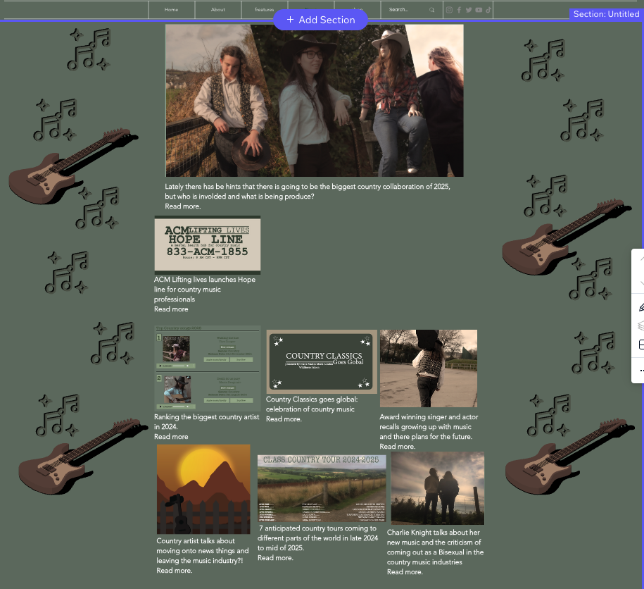
I started adding the photos to my website including making a ranting chart of the best music which includes making a couple of album covers along side making a ranting chart, i wanted to make a tour posted since in my magazine I mentioned in the content pages about tours and the people, i wanted to make a poster with those people so it can have a link back to the magazine.


I started to add more of my images to the actual website, a few on the home page and a few on the news page too, i also added a line and text so it organised and show what you are expecting next such as the video and the core values, this is to make it clearer of what things are.